24 April - 30 April
Section outline
-

Complete work in your Global Studies Book.
- Read through Climate Graph guidelines
- Work through information on Climate Graph Data
- Plot graph using graph paper and glue into your Global Studies book
- Compare graphs using information provided in Comparing Climate Graphs
Use PDF's in Google Classroom

Introduction
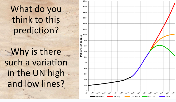
What do you think to this prediction?
Why is there such a variation in the UN high and low lines?
Starter
Match up the key words with the correct definitions using the whiteboard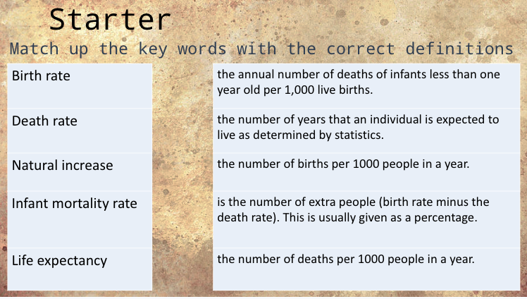
Main
Look through the different types of charts and graphs that can be used to present categories of data in regards to populations.
A population pyramid is a way to visualize two variables: age and sex. A population pyramid is a graph that shows the distribution of ages across a population divided down the center between male and female members of the population. The graphic starts from youngest at the bottom to oldest at the top. It is called a population pyramid because when a population is growing (there are more babies being born than there are people dying), the graphic forms the shape of a triangle.
Watch the video on population pyramids
What information does a population pyramid show us?
How can we compare two countries using one?
What does this tell us about how developed each country is?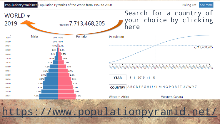
Use the website https://www.populationpyramid.net/ to search for countries of your choosing and compare them and discuss the differences.
Activity 1
Introduce the three categories of countries LIC, MIC and HIC (low, medium and high-income countries).
Label each population pyramid using the above terms. Then use the information slide to copy down facts relating to each pyramid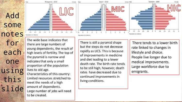
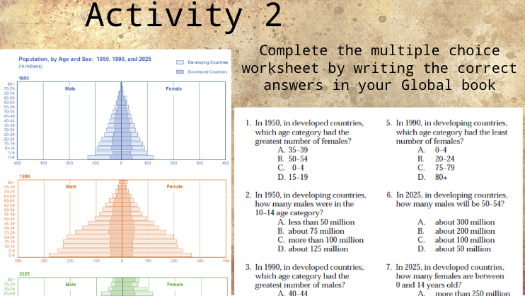
Activity 2
To use 3 population periods from different periods of time that also illustrate the populations of developed and developing countries. Pupils are to answer the multiple choice questions by highlighting the correct answers.
Use the website https://www.populationpyramid.net/ to search for countries to complete 3 population graphs for 3 different countries in your Global Studies book.