
26 September - 2 October
Section outline
-

EXPLORE / TŪHURA learning intentions:
- We are ANALYZING population to make judgements about growth, reproduction and country development.

IntroductionMany of the vast differences we see in societies across the globe can be related to the composition of their respective populations. This is true on the local, state, and national level.
So when exploring variations among countries, a good place to start is with their population pyramids – graphs that display the age and sex distribution of the country’s population.
To help make population projections for different countries, demographers look at the profile of the countries’ residents.
- What are the ages of the people?
- How many are men?
- How many are women?
Taking this information, they construct population pyramids that depict the configuration of a country’s population as impacted by over 80 years of economic, political, and natural events. Vocabulary: cohort, demographers, population pyramids, zero population growth.
Concept
The age and sex distribution of a population affects its growth rate and provides information on its past, present, and future growth patterns.
Objectives
We will be able to:
- Describe the three general shapes of population pyramids and their meanings.
- Construct a population pyramid for one of six different countries.
- Make correlations between the shape of a country’s pyramid and its growth pattern.
- Analyze countries’ population pyramids to make inferences about past events, current trends, and future growth.
Skills
Calculating percentages, graphing and analyzing data, interpreting bar graphs, comparing and evaluating, writing method
We will use real-world data to construct and interpret population pyramids and discuss differences in population growth rates among several different countries.
Part 1: What is a Population Pyramid?
Procedure
1. This is a type of graph used by demographers to study the distribution of people across sex and age categories.

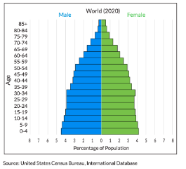
2. This graph represents the entire world population, sorted by age and sex – with the youngest at the bottom and the oldest at the top and males on the left, females on the right. Each age level/sex grouping is called a cohort. A cohort represents the percentage of people within that sex and age range within the population. So on the world population pyramid, we can see that 4.5 percent of the global population is made up of males aged 0-4.
3. Answer the following comprehension questions in your book.
a. What is the largest age cohort and how can you tell?
b. What cohort makes up 4 percent of the global population?
c. Where are you represented on the pyramid? What percentage does your cohort represent?
d. Are there currently more old people or young people living on the planet? How can you tell?
4. What can you tell me about the shape of the world population pyramid and do you think the graph represents a population that is growing or shrinking and their reasoning.
5. This graphs differs because it shows the percentage of a population that falls within each reproductive category provides clues to the population’s future growth. As such, the shape of a population pyramid reveals a lot about how a population is growing.

Now what does this graphs tell you about the populations future growth.
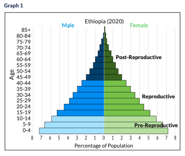
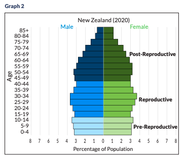
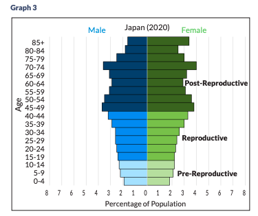
6. Analyse the three sample population pyramids below.
• Graph 1: Expanding – Ethiopia. The triangular shape reflects a growing population. A significant percentage of people are in the pre-reproductive age groups. As those children age and enter their reproductive years and start having children of their own, the population will almost surely grow.
• Graph 2: Stable – New Zealand. The rectangular shape shows a stable population. There is a fairly even distribution of people across each age group. Generations are replacing each other so the population will not grow or shrink.
• Graph 3: Diminishing – Japan. The cup shape shows a shrinking population. The largest percentage of people are in their post-reproductive years and no longer having children. As fewer and fewer people reach reproductive age, the size of the population will decrease.
Part 2: Exploring Pyramids from Across the Globe
Procedure
1. Open the Student Worksheet and the Pyramid Graph Paper on Google Classroom and you will be assigned one of the six countries, work in pairs.
2. The figures on the Worksheet are the population of each age group within each sex for each particular country. In order to construct the country’s pyramid, students must first calculate the percentage of the population of each sex in each age group.
Example:
- According to the Worksheet, the total population of the United States in 2020 was 332,639,102.
- The population of U.S. males aged 0-4 was 10,445,659. 10,445,659 = .031 or 3.1% 332,639,102
- Complete these calculations for each cohort. (total population / total cohort)
3. Construct a population pyramid for their assigned country by graphing the percentage data onto the Pyramid Graph Paper.
Discussion Questions
1. Can you tell from the data if there are more male or female babies in each country?
2. Can you tell from the graphs which country has the most people?
3. Are there more elderly females or males?
4. If you had a business and wanted to capitalize on your information about the population age distribution for the United States, what would you sell and why? What about a business in Nigeria? A business in Germany? United States
5. Which of the six countries is growing the fastest? How do you know? Can you think of any other information we can infer from the pyramid shape?
6. Looking at the pyramids, which countries appear to have the slowest rates of population growth? How can you tell?
7. Which country would you suspect is closest to zero population growth?
8. What factors would change the shape of the pyramids in the future?
9. There are two noticeable “bumps” on the U.S. population pyramid. What do these larger cohorts correspond to?
10. China’s population pyramid is the most varied of the six. Can you think of any historic events from the past 85 years that helped shape the Chinese pyramid?
11. Which of the three general pyramid shapes would you use to describe India’s population pyramid? What does this mean for India’s future growth?
12. Compare and contrast the population pyramids of Nigeria and Guatemala. How are they similar/different and what does this mean for each countries’ future growth?